 由 google
Understanding the Power of uni-list

As a developer, you know that creating an efficient and visually appealing list component is crucial for enhancing user experience. In this article, we’ll delve into the intricacies of the uni-list component, a powerful tool in the Uni-App framework. By the end, you’ll be equipped with the knowledge to leverage this component effectively in your projects.
What is uni-list?
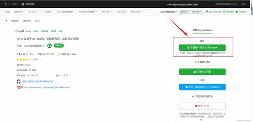
uni-list is a versatile and efficient list component provided by the Uni-App framework. It simplifies the process of creating lists in your applications, allowing you to focus on other critical aspects of development. This component is designed to be flexible and adaptable, making it suitable for a wide range of applications, from news feeds to product catalogs.
Basic Usage
Integrating uni-list into your Uni-App project is straightforward. First, ensure that you have the uni-ui library installed. Once that’s done, you can start using the uni-list component in your page templates. Here’s a basic example of how to use it:
<uni-list> <uni-list-item title="List Item 1" note="Description" show-arrow></uni-list-item> <uni-list-item title="List Item 2" note="Description" show-arrow></uni-list-item> <uni-list-item title="List Item 3" note="Description" show-arrow></uni-list-item></uni-list>In this example, we have created a simple list with three items. Each item has a title, a description, and an arrow indicating that it can be expanded or clicked.
Advanced Configuration and Customization
uni-list offers a variety of configuration options and customization features to suit your specific needs. Here are some key features:
| Property | Description |
|---|---|
| title | The title of the list item. |
| note | A brief description or additional information about the list item. |
| show-arrow | Indicates whether an arrow should be displayed next to the list item. |
| clickable | Enables or disables the click event on the list item. |
| disabled | Disables the list item, preventing any interaction. |
These properties can be combined to create a wide range of list items, from simple text entries to complex components with additional functionality.
Implementing a List with uni-list and uni-load-more
One common requirement in mobile app development is the ability to load lists with more items as the user scrolls. To achieve this, you can use the uni-load-more component in conjunction with uni-list. Here’s an example of how to implement this:
<uni-list> <uni-list-item title="List Item 1" note="Description" show-arrow clickable @click="loadMore"></uni-list-item> <uni-load-more status="loading"></uni-load-more></uni-list>In this example, we have added a uni-load-more component to the list. When the user reaches the end of the list, the loadMore method will be triggered, allowing you to load more items into the list.
Real-World Applications
uni-list is a versatile component that can be used in a variety of real-world applications. Here are a few examples:
- News Feeds: Display news articles with titles, summaries, and images.
- Product Catalogs: Showcase products with images, names, prices, and ratings.
- Social Media Feeds: Present user-generated content with user profiles, comments, and like buttons.
- Settings Pages: List various options and settings for users to configure their preferences.
These are just a few examples of the many ways you can use uni-list to enhance your