 由 google
Are you looking to enhance the visual appeal and functionality of your web pages? Look no further than the Uni Card component. This versatile and powerful tool, developed by DCloud, is a game-changer for web developers. In this article, I will delve into the intricacies of the Uni Card, exploring its features, usage, and the benefits it brings to your projects.
Understanding the Uni Card

The Uni Card is an official component provided by DCloud, a leading provider of mobile and web development solutions. It is designed to be a flexible and customizable card layout that can be used to display information in a visually appealing and structured manner. Whether you are creating a blog, a portfolio, or an e-commerce website, the Uni Card can be a valuable asset in your toolkit.
Basic Structure and Usage

At its core, the Uni Card is a simple yet effective way to present content. It consists of a title, a description, and an optional image. The title is typically displayed prominently at the top, followed by the description and any additional information. The card can also be configured to have a shadow effect, which adds depth and visual interest to the design.
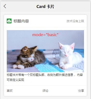
Here’s a basic example of how to use the Uni Card in your project:
<template> <view> <uni-card :isShadow="true" title="Title Content" mode="basic" extra="Technical Limitations Are Non-existent" @click="clickCard"> <view> <view style="height: 350rpx;"> <image style="height: 100%;" mode="aspectFill" src="https://vkceyugu.cdn.bspapp.com/VKCEYUGU-dc-site/094a9dc0-50c0-11eb-b680-7980c8a877b8.jpg" /> </view> <view class="content-box"> <text style="font-size: 14px;">Your content goes here...</text> </view> </view> </uni-card> </view></template><script>export default { components: {}, data() { return {}; }, methods: { clickCard() { uni.showToast({ title: 'Click on the card', icon: 'none' }); } }};</script><style></style></code>Customization and Flexibility
One of the standout features of the Uni Card is its high level of customization. You can easily modify the title, description, and image to suit your specific needs. Additionally, the card can be styled using CSS, allowing you to achieve a unique look and feel for your web pages.
Here's a table showcasing some of the customization options available for the Uni Card:
| Property | Description |
|---|---|
| title | The main title of the card. |
| description | The description text that appears below the title. |
| extra | Additional information that can be displayed alongside the title. |
| isShadow | Enables or disables the shadow effect on the card. |
| mode | Specifies the card mode, such as "basic" or "full". |
| image | The image to be displayed within the card. |
Event Handling and Interactivity
The Uni Card component also supports event handling, allowing you to add interactivity to your web pages. For example, you can bind a click event to the card, as demonstrated in the previous example. This can be useful for triggering actions, such as opening a new page or displaying a modal dialog.
Conclusion
In conclusion, the Uni Card is a powerful and versatile component that can help you create visually appealing and functional web pages