 由 google
Understanding the uni-form Component in uni-app

The uni-form component is a fundamental building block in the uni-app framework, designed to facilitate data collection and submission. It serves as a container for various form elements such as input, checkbox, radio, and picker, making it an essential tool for creating interactive and functional forms in your applications.
Basic Usage
When using the uni-form component, it’s important to remember that it is a double-tag element, meaning it requires both an opening and a closing tag. For instance, an incorrect usage would be:
<form />This is not the correct way to use the uni-form component. Instead, you should structure it like this:
<form></form>While the uni-form itself is a container, it’s not practical to use it without any content. Here’s an example of how you might structure a basic form with the uni-form component:
<form> <view class="form-group"> <input placeholder="璇疯緭鍏ュ鍚峔" /> </view></form>Form Submission and Reset Events
One of the key functionalities of the uni-form component is handling form submission and reset events. When a user submits a form, the @submit event is triggered. Similarly, when a user wants to clear the form, the @reset event is fired. Here’s an example of how you can handle these events:
<form @submit="submitForm" @reset="resetForm"> <view class="form-group"> <input placeholder="璇疯緭鍏ュ鍚峔" /> </view> <button form-type="submit">Submit</button> <button form-type="reset">Reset</button></form>Report-submit and Report-submit-timeout Properties
The report-submit property is used to enable form submission with the report-submit feature, which is particularly useful for collecting user data for analytics purposes. The report-submit-timeout property, on the other hand, allows you to set a timeout for the report-submit event. Here’s an example of how to use these properties:
<form report-submit="true" report-submit-timeout="5000"> <view class="form-group"> <input placeholder="璇疯緭鍏ュ鍚峔" /> </view> <button form-type="submit">Submit</button></form>Handling Validation with uni-form
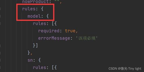
Validation is a crucial aspect of form handling, and the uni-form component provides built-in support for validation. You can use the rules attribute to define validation rules for your form fields. Here’s an example of how to use validation rules:
<form :rules="rules" :model="formData"> <view class="form-group"> <input name="username" placeholder="璇疯緭鍏ョ敤鎴峰悕" /> </view> <view class="form-group"> <input name="password" type="password" placeholder="璇疯緭鍏ュ瘑鐮乗" /> </view> <button form-type="submit">Submit</button></form>| Field | Rule | Message |
|---|---|---|
| username | required | This field is required |
| password | minLength: 6 | Password must be at least 6 characters long |
Dealing with Common Issues
As with any technology, issues may arise when using the uni-form component. One common problem is related to the use of modelValue in the rules attribute. If you encounter an error related to modelValue, it’s likely that your form data contains object-formatted attribute values. To resolve this, you can switch to using model